# Attributes
Attributes are used to describe characteristics or qualities of your Shop and Booking products, as well as other elements used on your website, such as forms.
Tabs which specify a product are called attribute groups. Attribute groups can contain several attributes of all types. Each attribute can be used only one time per attribute group and the same attribute cannot be used in multiple attribute groups.
You can add as many attribute groups and attributes as you like, specify them and adjust them according to your business needs.
Example of DG1 attributes: Currency in the Formatting section of your General site settings is an attribute group. Decimal separator, Thousands separator, Number of decimals and Currency format are attributes within that attribute group.
# In this section
# Add new attribute
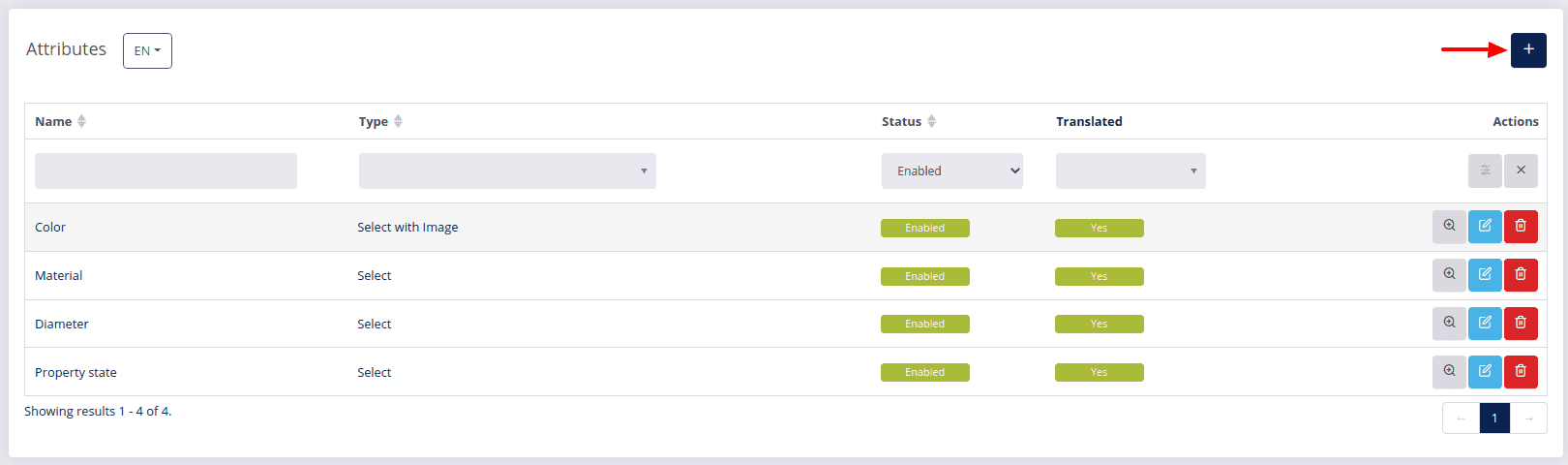
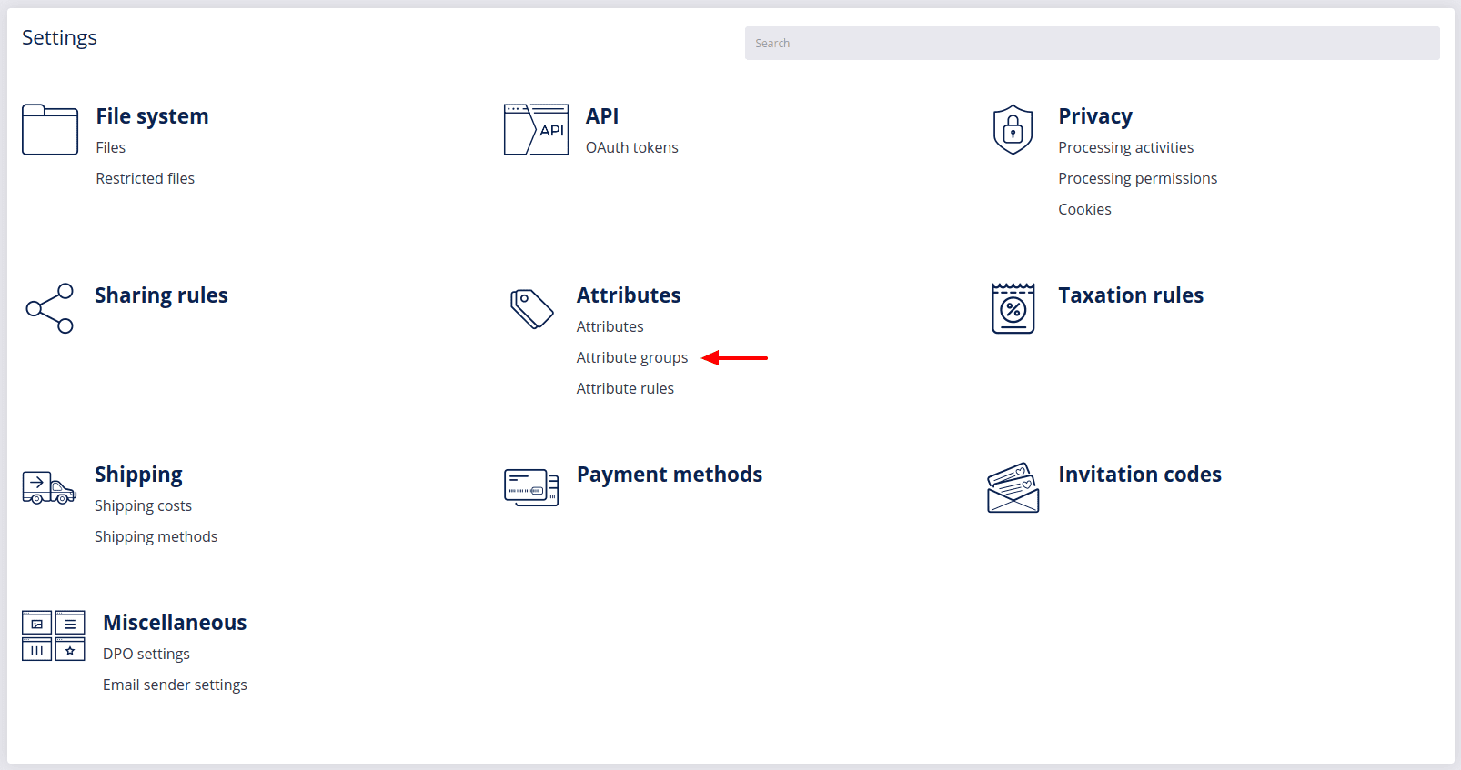
- Navigate to the Settings section in your DG1 admin panel and select Attributes.
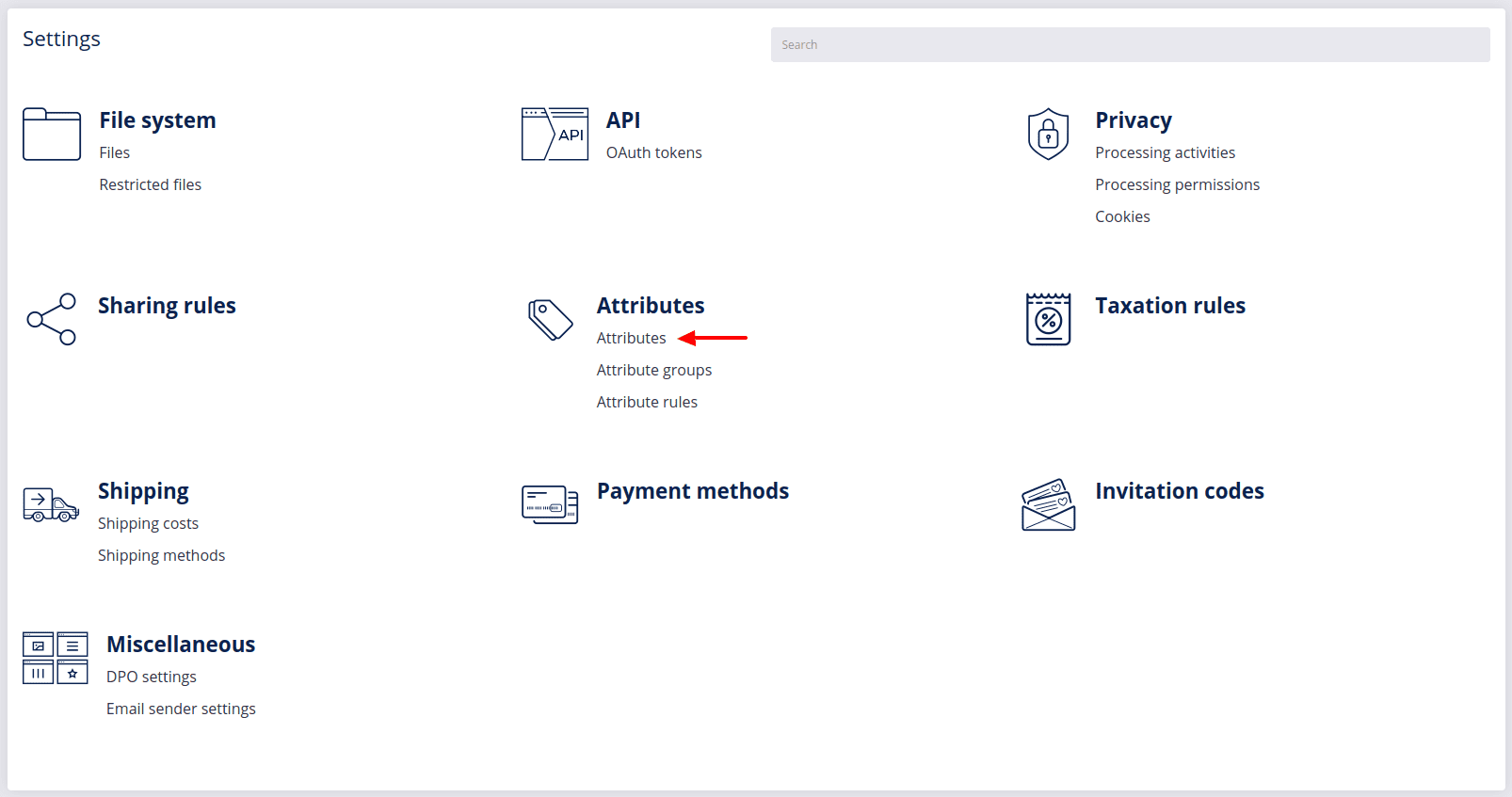
- To add a new attribute, click Add
 .
.
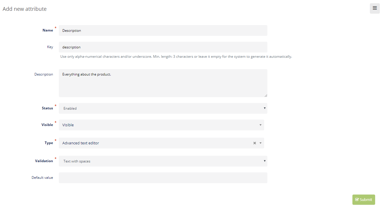
- Enter details about the new attribute:
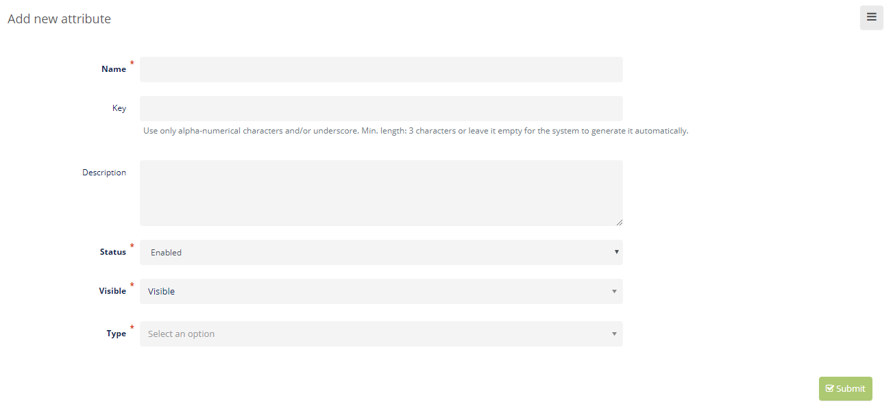
Example of details for adding a new attribute to describe products:
- The Name of the new attribute will be “Product description”.
- The Key is automatically inserted.
- The Description of your attribute should be something very simple, for instance Everything about the product.
- Status must be set to Enabled.
- Visibility must be set to Visible.
- Type defines different options of how you will deliver information which will describe the product. Example: The type of information used for describing a product in the above example should be set to Advanced text editor. For attribute Expiration date the type should be set to Date. For attribute Color the information can be provided with types such as Select, Select with image or Multi-select.
Note
With certain attribute types you can also set the Default value to be used with your products. Just remember to save each product or product group for the respective attribute to be used with all products within that group.
# You can choose between the following attribute types:
| Attribute type | Description | Preview |
|---|---|---|
| Text*** | Plain text field, used to enter short text strings without formatting, limited to one line. |  |
| Date*** | Date field with a date picker (a calendar grid from which you choose the year, month, and day). |  |
| Text area*** | Text area field or a multi-line text input field used to enter longer plain text strings in multiple lines. |  |
| Number*** | A number field that accepts either integer or decimal numbers. |  |
| Advanced text editor*** | A rich text field that accepts alphanumeric characters and text formatting options. |  |
| Select | Selection field for choosing a single predefined text option. |  |
| Select with image | Selection field for choosing a single predefined option with an image. Example: product color variations | 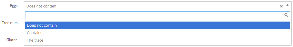 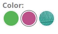 |
| Multi-select | Selection field for choosing multiple predefined options. | 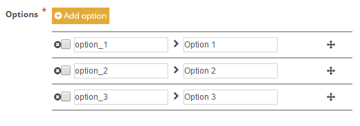 |
| Link to | Selection field for choosing a single predefined option. | 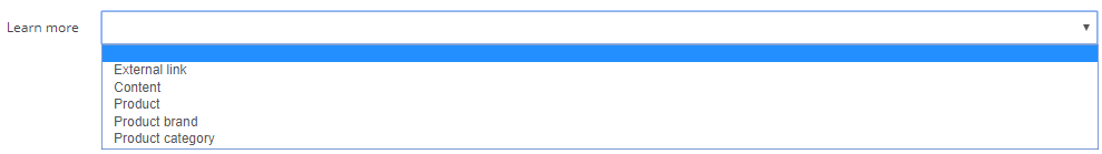 |
| Checkbox | Selection field, usually used for choosing between two mutually exclusive options by checking or unchecking the box. |  |
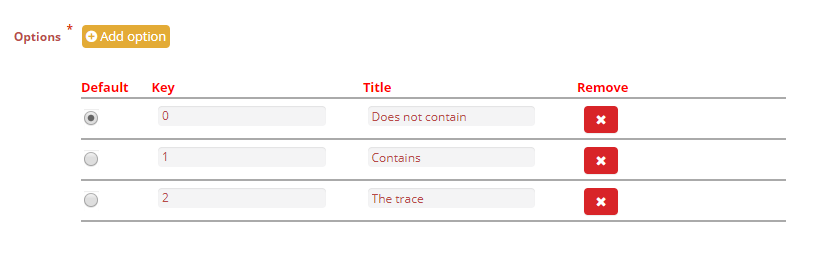
- With all selection fields (Select, Select with image, Multi-select) you must specify the available options. Example:
*** Validation: With some attribute types (Text, Date and Number) you can choose between different forms of validation, which are listed below.
| Validation types | Description |
|---|---|
| Text with spaces | This field accepts alphanumeric characters with spaces only. |
| Date | Date field with a date picker (a calendar to choose from). |
| Alphanumeric | This field accepts alphanumeric characters without spaces. |
| URL | A Uniform Resource Locator is the address of a given page on the World Wide Web, usually called a link. |
| Integer | Input field for whole numbers that can be positive, negative or zero. |
| Decimal | Input field for decimal numbers. |
- To save your new attribute, click Submit
 and the attribute will be added to the index page with all the attributes.
To view the details of each attribute, click View  .
.
You can Edit  and change the characteristics of each attribute, but do not forget to click Submit .
To delete attributes, click Delete  and confirm deletion with OK.
# Attribute groups
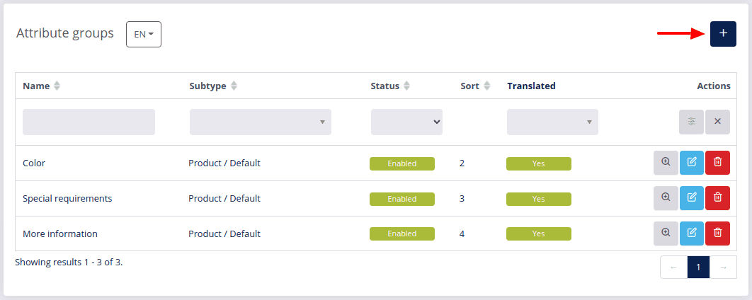
- Navigate to the Settings section in your DG1 platform admin panel and select Attribute groups.
- To add a new attribute group, click Add .
- Enter the attribute group details:
- Name your attribute group. Example: Product description.
- The Key is written automatically.
- Subtype/group - By selecting a model, the system knows where the attribute group will appear for instance with products or booking items.
Warning!
If you select Contact as the group, the group will be moved to the MARKETING attributes and the selected attributes will be removed from the SHOP section but will appear in the MARKETING under the newly created attributes group.
- Sort means that your attribute group in the front-end view will be displayed in the desired position but only after the default attribute groups. The higher the number, the more in the back your attribute group will be placed.
- The Status should be Enabled, to apply your attribute group in the shop.
- Attributes - Select the attributes that you would like to include in the new attribute group by clicking the Plus
 next to each attribute. You can add more than one attribute to each attribute group.
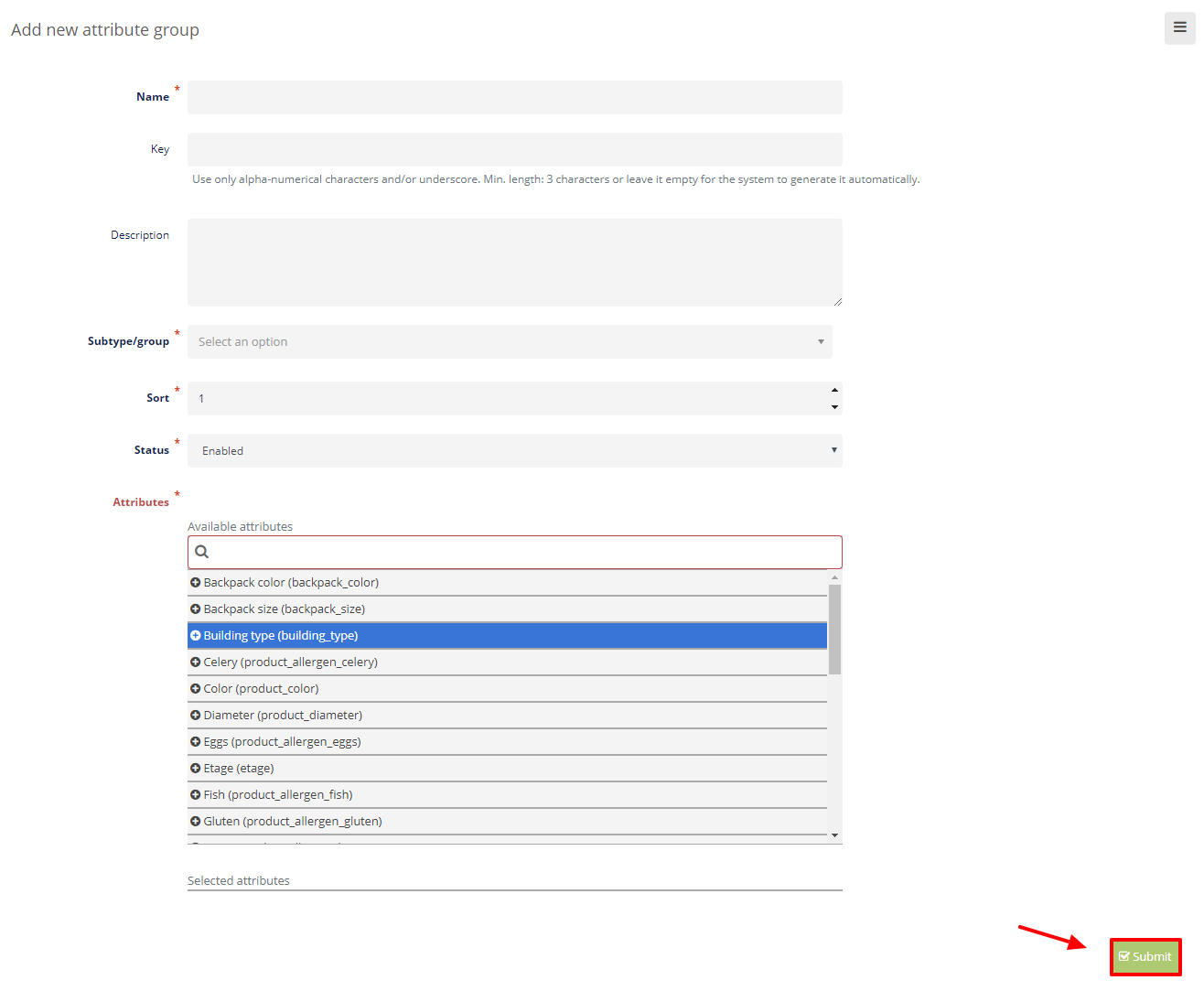
- To save your new Attribute group, click Submit .
To edit an attribute group click Edit . You can add and change information. To save changes click Submit .
To view your attribute group, click View . You will see all the information on the attribute group.
To delete an attribute group, click Delete and confirm it with OK.
# Attribute rules
Using the attribute rules you can manage the appearance of your attributes. If you wish to show a specific attribute on a specific site or product location, you can manage that with these rules really easily.
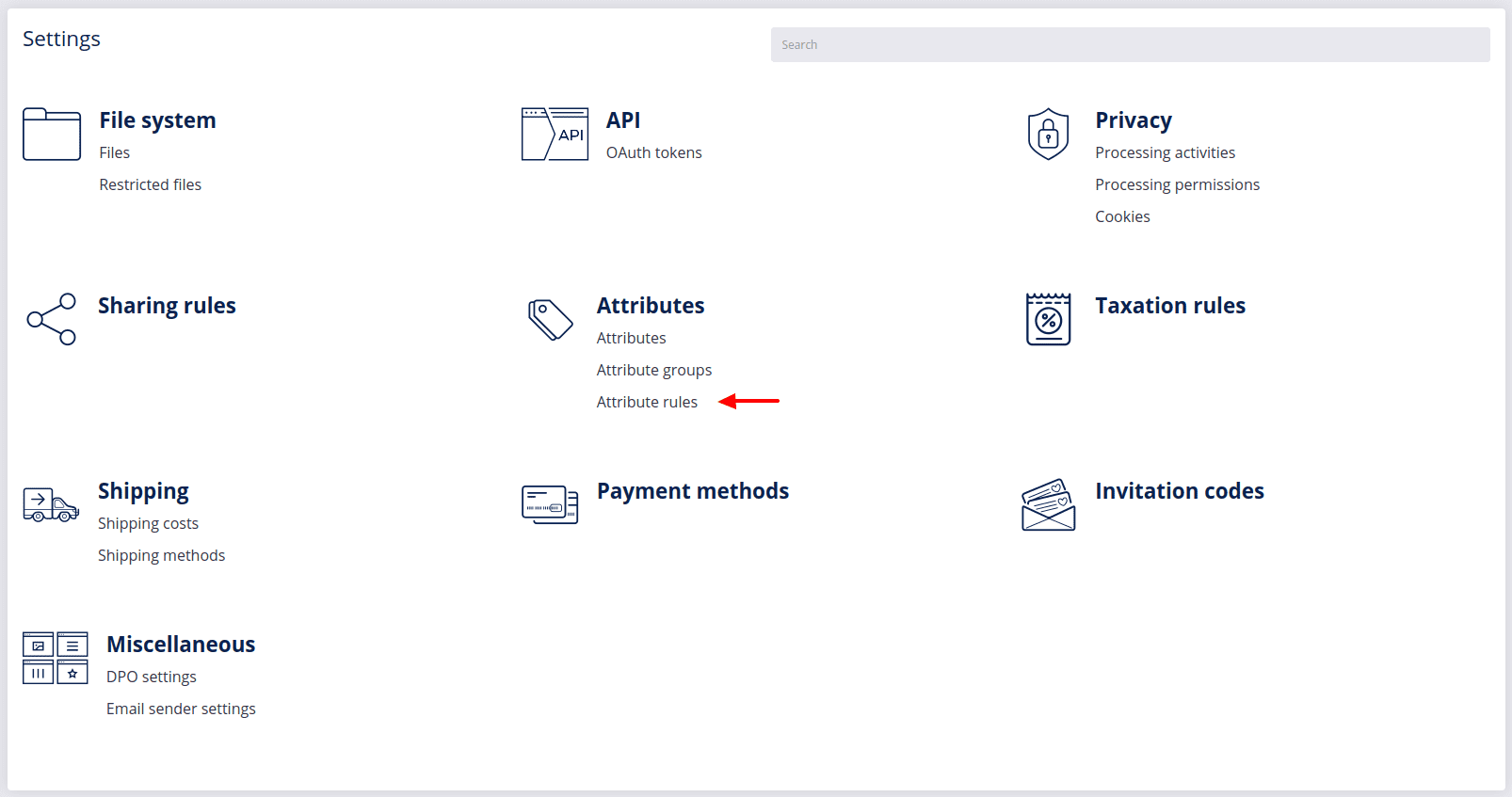
To create a new attribute rule, click Add .
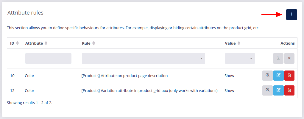
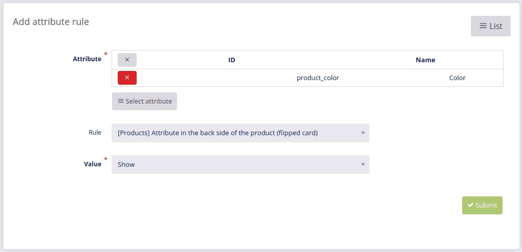
Select the Attribute and the Rule, which refers to the location of the attribute, and decide whether you wish to show or hide this attribute by selecting the respective option in the Value field.
In the table below you can view the available product rules and see how they are displayed in the front end:
| Attribute rule | Front-end view |
|---|---|
| Attribute as a grid filter | 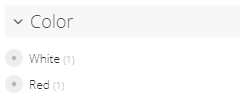 |
| Attribute as a numeric grid filter | 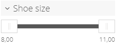 |
| Attribute on the product page tabs | 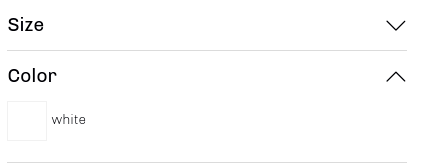 |
| Attribute on the product page description | 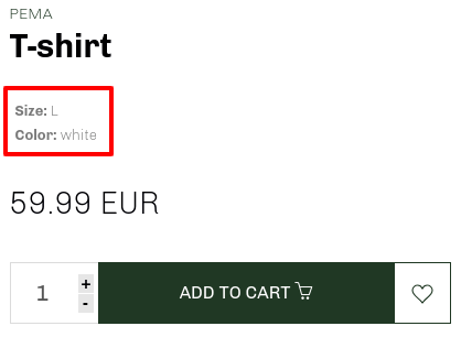 |
| Attribute in the back side of the product (flipped card) | 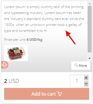 |
| Attribute on the compare products page (eg: Date) | 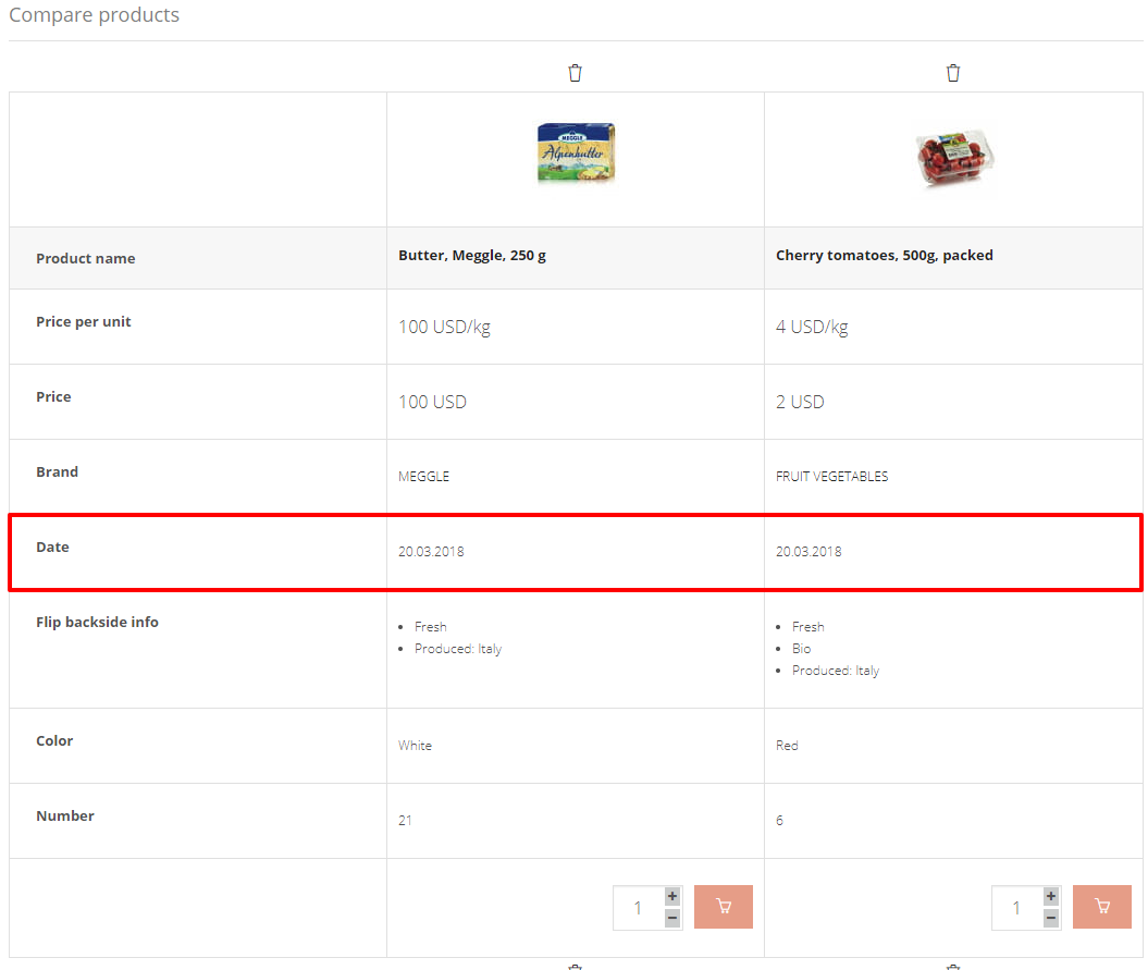 |
| Attribute in the order confirmation email under the product name | 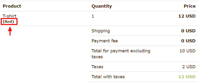 |
| Variation attribute in the product grid box (only works with variations) | 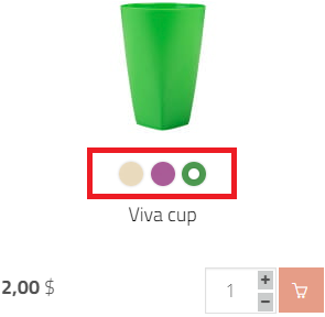 |
Example: Attribute: Color, Rule: Attribute in the back side of the product, Value: Show...
To save your new rule, click Submit .
To edit an attribute rule, click Edit , change it and confirm your changes with Submit .
To delete an attribute rule, click Delete and confirm with OK.